
The digital landscape is constantly changing. According to Moore’s Law, the capability of our computers doubles every two years and we keep paying less for them. So essentially, we’re getting more powerful machines in more people’s hands easier than ever before.
What does this mean for developers? It means they constantly have to follow updates and trends to keep up with the evolution of technology. That is why staying ahead is paramount to keeping your website relevant and your UI and UX top-notch.
We stay one step ahead every day by using these current website trends to blow the competition out of the water:
Progressive Lead Forms
A lead generation form is an integral part of any marketing website. When building your lead form, you want to know as much as you can about your visitors, but you don’t want to overwhelm them with questions.
This is where progressive lead forms come in. A progressive lead form is a lead form that gathers more information each time a user fills it out. A lot of CRMs, like Hubspot, offer an integration with your website that allow for your website to recognize the user and display fields we don’t yet know about the lead.
For instance, a user visits your website for the first time and fills out your “contact us” form. This form asks for their basic information; first name, last name, phone number, and email. Once connected, they receive an email that drives them to the website where they come across another lead form to get more information about a specific service your company provides. Since this is a returning user, your CRM and website identify this and can provide different form fields to collect new information, like company name, service of interest, and address.
Clear, Actionable CTAs
We can help to curate the browsing experience by placing prominent, actionable calls-to-action tactfully on every page. This is most important on our homepage, where the journey stops and ends for many users.
The common metric for assessing how quickly a user leaves a site is called the bounce rate. Google defines this as, “…the percentage of all sessions on your site in which users viewed only a single page…” So whether a user is viewing your site for the first time, or is a repeat visitor, we want to guide their journey with CTAs to help encourage users to stay on your site.
If your website is for a service-based company, having a succinct description of your services or latest offering at the top of the homepage can educate a user within moments of their arrival about what you do, and how to sign up for their services.

Streamlined Navigation
Your CTAs create a guided experience through your site for your users, and a well-crafted navigation empowers users to find what they are looking for. But it is only well-crafted when we do not inhibit users from finding important pages and navigating quickly and intuitively.
Mobile navigations can be the most tricky to plan and execute, especially for retail, or any organization that has a lot of products or services spanning lots of different pages. Designing a navigation where users can jump in and out of the navigation intuitively, and make them feel in control by prioritizing frequently visited pages.
When a mobile navigation has been activated, the user musn’t scroll at all using this menu. All primary categories and pages should be visible above the fold. Top categories and pages should be organized top-to-bottom by visitor frequency, and any subnavigation items that live underneath primary items should be revealed as primary items are touched.
Exiting the navigation should be as easy as it is to activate. So either your mobile navigation needs to have a prominent exit icon, preferably with a position, color or label to make it stand out, or a mobile navigation that doesn’t span the full-width of the screen, allowing the user to tap in the negative space to exit the menu.
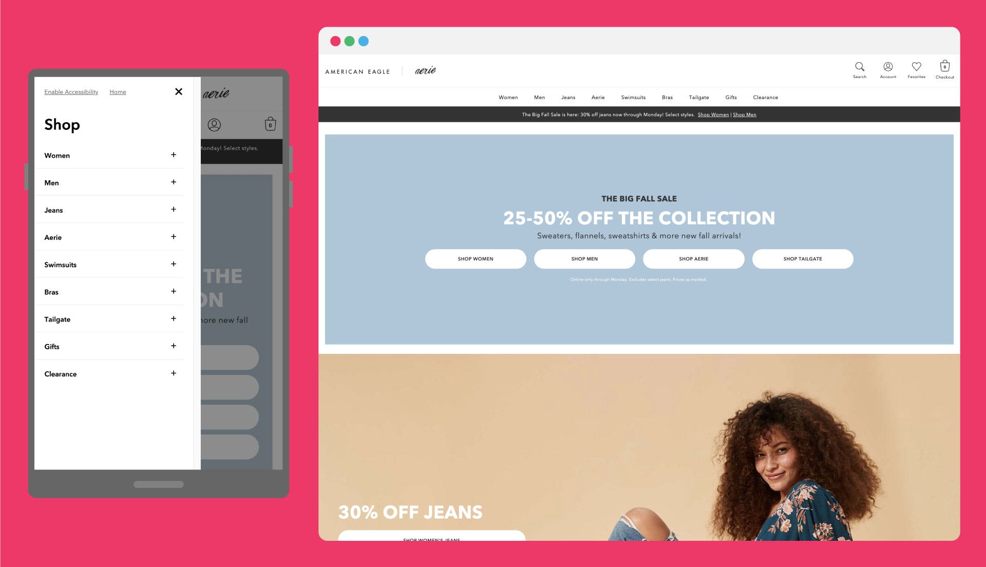
American Eagle examples a lot of these practices within their mobile navigation experience. The mobile navigation takes up about 60% of the screen, clothing categories are listed in order of popularity, sub categories are teased with the inclusion of a “+” icon, and differences in font styles and indentation establish an intuitive hierarchy.
In about a second, with just three taps, the user navigates to a super specific product category, like Women’s Cardigans, because all of these optimal design attributes work in synchronization to make a great navigational experience.
Hey Alexa, is my website optimized for voice search?
Artificial intelligence like Cortana, Siri, Alexa, and Google Assistant are making voice search not only more commonplace, but are also making users more comfortable with it. There will be 1 billion devices with voice assistants in use this year, therefore optimizing your website for these services will ultimately help it come up in results for a voice search.
Here are some tips for optimizing your websites for voice search:
- Optimize SEO for local searches (searches that end in “near me” or in “x” city)
- Focus on phrases and long-tail keywords common in natural speech (consider the way people typically speak and ask questions when choosing keywords and phrases)
- Reduce loading page time for your website
- Make sure your business is listed online (if you are a local business)
- Think about the queries users might be making to find your business
Ultra-Fast Load Time
Page speed and website load time alone will make or break your bounce rate. More than half of internet users expect a page to load in less than two seconds, and over 40% will abandon the page if it takes more than three seconds.
Optimizing your website for a fast load time means you will minimize your bounce rate and increase your users’ time spent on your site. We recommend running a website audit at least once a year to gut check your website loading performance and making changes to your site accordingly. A tool we use for this is Lighthouse in Google Chrome Developer Tools.
Here are some ways to improve your page load speed:
- If you have a resource-heavy website with many graphical elements, consider using lazy loading or infinite scroll so your website will only load the content a user sees and needs.
- You can also use asset compression to minimize the download size of your images, videos, CSS, etc.
- Utilize caching so your browser request doesn’t have to go all the way to the web server to complete a request.
The Bottom Line
It’s important to keep your website up to date and user friendly so that users regularly come in and come back often. People have very limited time and shorter attention spans now more than ever, meaning your website needs to load fast and grab their attention quickly to keep them on page and keep your bounce rate low.
There is an overabundance of websites available. Making yours stand out provides a better customer experience, makes your business more memorable, and could be the difference between a lead gone cold and a conversion.
Combining these tips will help you attract users and keep them on your website with an excellent user experience. Our web developers have created some pretty incredible websites using these tactics and we’re really proud of the work we do.