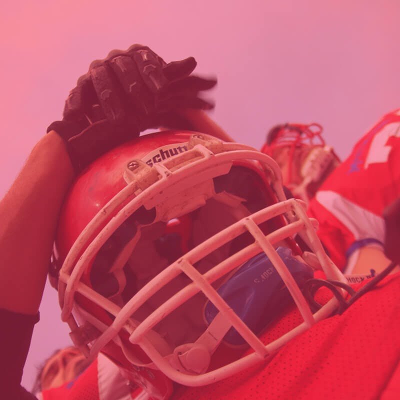
What do soap operas, football and the color wheel all have in common? Well, you’re darn well about to find out.
Ah, sports. Competitive athleticism saturated with beer and anxiety. Turns out, there’s more to what you see on the field than you might think. I’ll defer to Frank Abagnale Sr., who always said, “Why do the Yankees always win? Because the other teams can’t stop staring at those damn pinstripes.”
Let’s start with the color wheel. The color wheel is a wheel of color. The cool thing about the color wheel is that every color on it has a relationship with every other color on it. Which probably means nothing to you. I get it. But you should keep reading because it gets pretty interesting.
Looking at the color wheel, every color has positive and negative aspects to it. A color’s impact can be affected or changed just by placing it next to another color. Red next to its complement green, for example, can cause the eye to vibrate with energy, while red next to black may give you the feeling of power and class.
So, the complementary colors on the color wheel, the ones that are opposite each other, are green and red, orange and blue, and purple and yellow.
Let’s get back to soap operas. What do they have to do with anything, you ask? Great question. Why do we like soap operas, shows like Downton Abbey or Making a Murderer? Note: if you haven’t heard of these shows, you live under a rock, where you should probably stay. We watch and engage with all of this because the human brain is attracted to drama.
It has been proven that we as humans don’t like smooth sailing – we like rough waters once in a while to keep things interesting. That’s why we play video games, watch scary movies, read romance novels and can’t wait to hear all about what happened when your best friend ran into her ex at the bar Saturday night. Same goes for what our brain likes to see, visually.
So, keeping in mind those complementary color pairs - green and red, orange and blue, purple and yellow – a lot of times, sports teams, especially professional sports teams, choose to dress their players in uniforms that pair these colors, or tones and tints of these colors, together, creating that energy mentioned previously. This move is an advertiser’s dream, when subtle color psychology and understanding the intrinsic human need for drama are used to promote a brand.
You get the gist.
And there you have it, a very brief explanation as to why your eye is drawn to certain colors you see on the field. Now you have something more intellectually stimulating to talk about while drinking beer and watching the game than what the mascot’s salary is. (It’s way more than yours, I assure you.)
Go team!
startribune.com
uniformcritics.com
thehockeynews.com
metsmerizedonline.com
